Photo editing does more than prepare your photos for print. It’s a key step in making photos that define your brand voice. Learn more with our practical tips. (Featuring LORETTA LEWIS and HEIDI KIRN)
You can’t have a great brand without a great photo editing style.
That’s not to say your post-production needs to reinvent the wheel or be over-the-top. Thoughtfully developed photography editing styles enhance your approach to storytelling, and, when used consistently, helps you establish a recognizable brand without ever adding a logo or watermark. This means someone could scroll past one of your photos on Instagram and almost instantly recognize it as yours.
In this article, we’ll consider the impact of two very different photo editing styles, and guide you toward developing a post-production style that’s all your own.
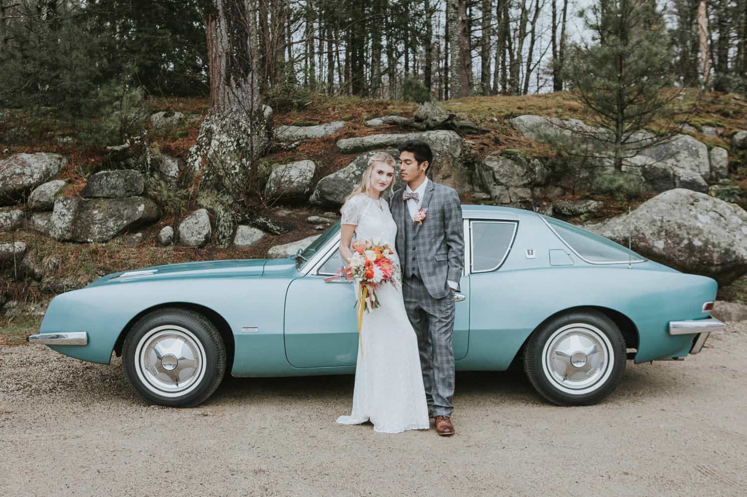
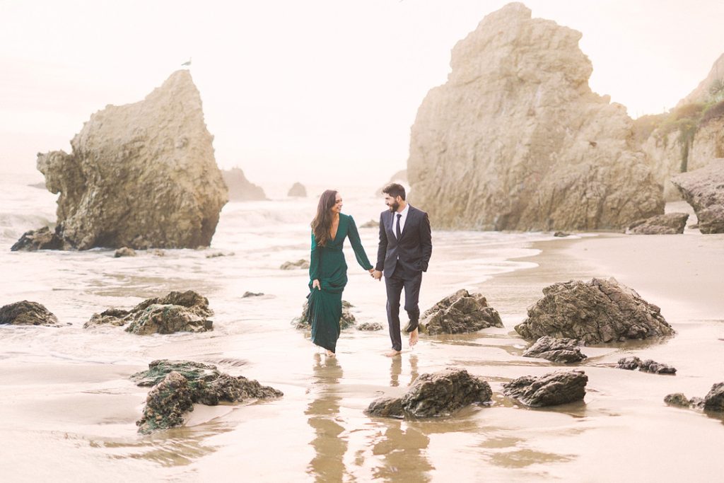
Photo by Heidi Kirn
Consistency is Key
To develop a consistent, identifiable post-production style, you’ll also need a consistent, identifiable photographic style.
Recognizable photo editing styles start with the imagery you create, and it means you need to be intentional about:
- shooting in consistent lighting conditions, whether that means full sunlight, open shade, or only with the added benefit of flashes and strobes.
- your exposures. The photo editing experience is dramatically different if your exposures are all over the place. It’s better to consistently under-expose by a stop than to have a blend of underexposed and overexposed photographs to contend with.
- your lens choice and aperture. A photograph shot at f/5.6 on a 35mm lens is going to look dramatically different from a photograph shot at f/2 with a 100mm lens. This means you could apply the exact same preset to both images, and they would still be wholly unique – simply because they were photographed with different tools and settings.
Simply put, consistent shooting will help you deliver a consistent final product.
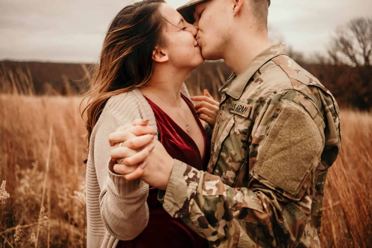
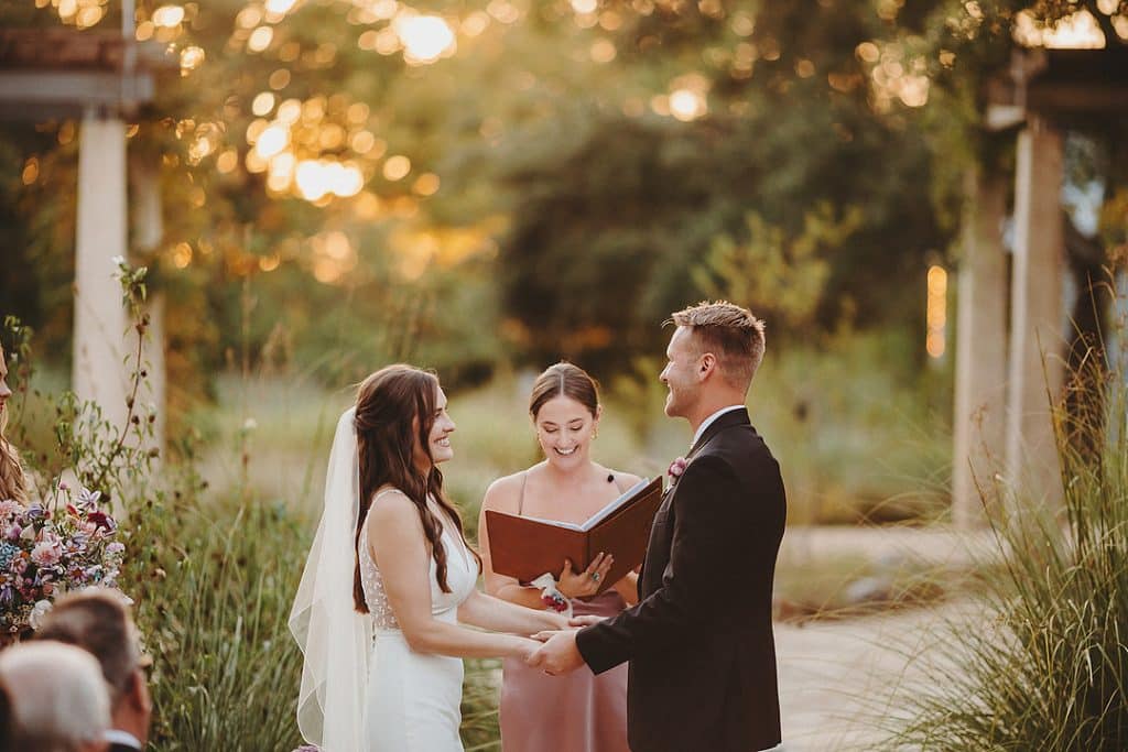
Photo by Loretta Lewis
Cool, Warm, Neutral, & Black-and-White
Your brand visuals don’t end with your logo and website. They’re supported and solidified by the colors and tones you emphasize in your photographs.
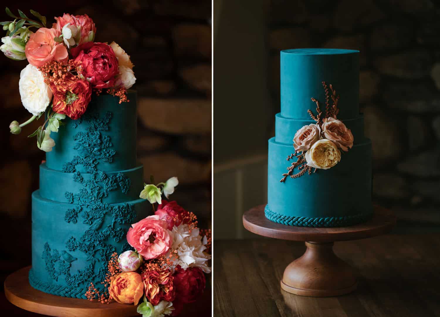
The photographs you see here are by Heidi Kirn and Loretta Lewis. You’ll notice that Heidi’s photos are decidedly cooler in tone, while Loretta’s are quite warm and golden. For both photographers, these tones blend beautifully with their brand colors and design style.
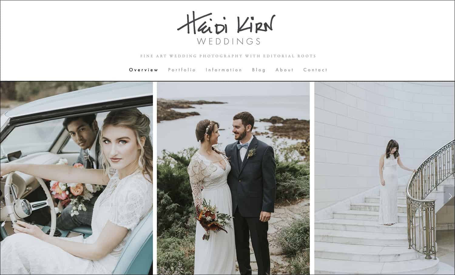
Heidi Kirn’s Website
If your photographs are neither dramatically warm nor noticeably cool, you likely prefer a more neutral photo editing approach, staying true to the original highlights, shadows, and skin tones. Likewise, while black-and-white photographs can be cool or warm-toned, they’re most often neutral, with 100% color desaturation.
Build a Beautiful Business.
Whether you prefer cool tones or warm tones, your photo editing should always result in gorgeous skin tones for everyone in the photograph. Your clients don’t want to look like Smurfs or Oompa Loompas; they want to look AMAZING.
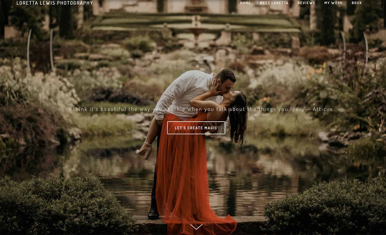
Loretta Lewis’ Website
No Shame in Presets
Maybe you’re hesitant to admit that you use purchased presets or filters on your photographs. But guess what? It doesn’t matter how you get there. What matters is that you’re giving your client an incredible finished product every time. If you’ve found that using Dapper Dan’s Delightful Presets Pack works brilliantly for your brand, keep at it! You don’t have to do everything the hard way to be a professional. If that was the rule, we’d all still be photographing weddings with pinhole cameras.

Photo by
PRO TIP: Stay True to All Skin Tones
Test your photo editing techniques on a variety of skin tones to make sure everyone looks fantastic. What works with one skin tone may not work with another!
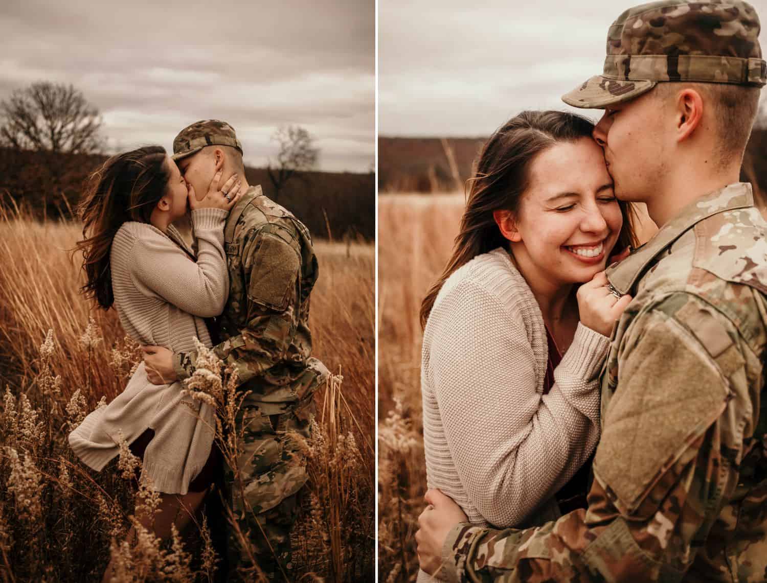
Photos by Loretta Lewis
Shadows & Highlights
Do you like your highlights crisp and bright, or soft and muted? Are your preferred shadows inky black or a soothing charcoal? The type of paper on which you print your photographs can mean the difference between beautifully synchronized prints or prints that look like they came from another photographer altogether.
Experiment with different types of paper and identify what pairs best with your post-production style. Lustre, deep matte, high gloss, fine art, canvas, metal: different mediums result in drastically different tones. Choose only to sell paper types that enhance your photo editing and brand voice.
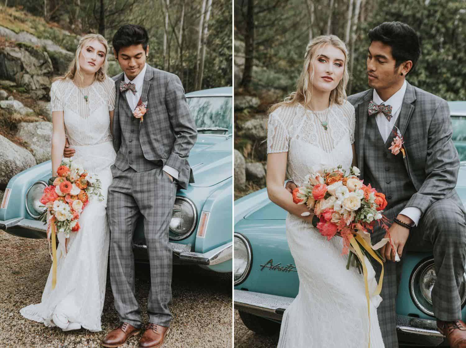
Photos by Heidi Kirn
Create a Mood that Boosts Your Brand
Take a look at Heidi’s cool-toned photos and Loretta’s warm-toned images. How do they make you feel?
Cool tones emit these feelings:
- calm
- clean
- expensive
Photos by Heidi Kirn
Warm tones suggest:
- energized
- expressive
- attainable
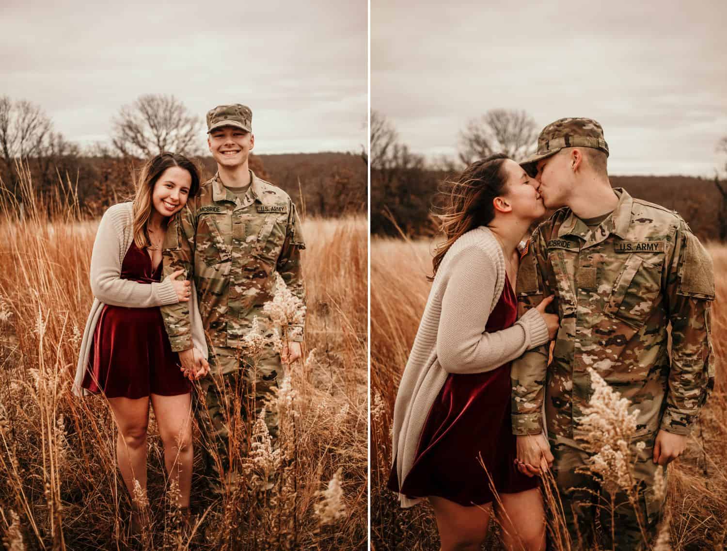
Photos by Loretta Lewis
And neutral tones (neither noticeably cool nor warm) create a sense of:
- balance
- safe
- honest
Get clients. Get paid. Get happy.
However you prefer to edit your photographs, make sure they align with your branding. A vibrant, bold logo may look abrasive when paired with soft, cool tones. Likewise, a delicate, soft logo may get lost when paired with strong, statement-making tones.

Photos by Heidi Kirn
Have you defined your photo editing style?
If you’re still working out your unique post-production approach, don’t stress! As you become more confident in your shooting style, you’ll also develop a clearer vision of how you want your finished photos to look.
If you already have a defined style in place, tell us how you developed it by commenting below!
|Written by ANNE SIMONE | Featuring HEIDI KIRN and LORETTA LEWIS | Design by MICHELLE ROSE

You May Also Enjoy…
Contributor